Album Photo Real Mehedi Free Framer Template Photography

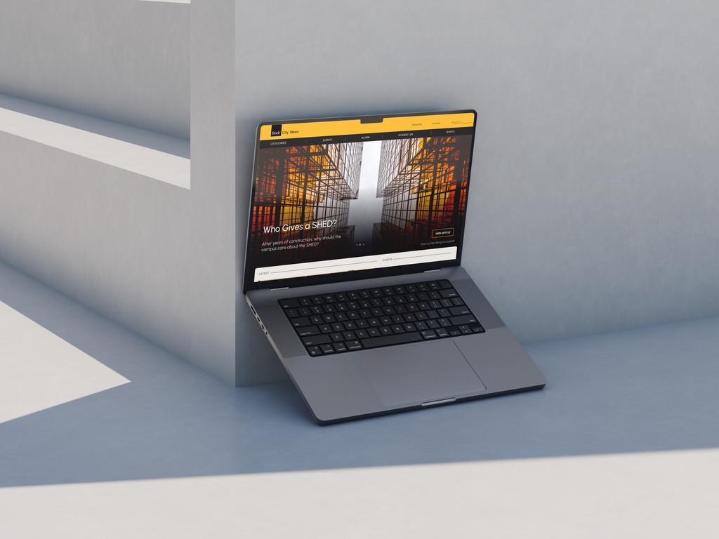
Brick City News - RIT News Page

Brick City News - RIT News Page

Overview

Tools

Figma, Adobe Illustrator

Year

November 2023

Skills

UI/UX Design, Branding

This web design was meant to remodel the Rochester Institute of Technology homepage. This site is meant to be targeted at RIT students, Alumni, professors, parents, and investors. Still, while designing I wanted to emphasize news that would be important to students, particularly students who are experiencing sed news on campus and from a distance. RIT's colors are orange and black, however, in this redesign, there's the subtle incorporation of bright yellow and other orange tones. Other goals were to bring a more modern feel to the site, representing a school of technology and advancements.

This web design was meant to remodel the Rochester Institute of Technology homepage. This site is meant to be targeted at RIT students, Alumni, professors, parents, and investors. Still, while designing I wanted to emphasize news that would be important to students, particularly students who are experiencing sed news on campus and from a distance. RIT's colors are orange and black, however, in this redesign, there's the subtle incorporation of bright yellow and other orange tones. Other goals were to bring a more modern feel to the site, representing a school of technology and advancements.

Process

During the initial stages of this project, it became clear that the priority was to bring a more modern feel to the site. This translated into bold, vibrant colors, sleek iconography, high contrast, and other new-age elements. The name and logo, "Brick' City News" is a reference to RIT's notable architectural design, which is then also translated into the unique alignment and the visible grid structure.

During the initial stages of this project, it became clear that the priority was to bring a more modern feel to the site. This translated into bold, vibrant colors, sleek iconography, high contrast, and other new-age elements. The name and logo, "Brick' City News" is a reference to RIT's notable architectural design, which is then also translated into the unique alignment and the visible grid structure.

Preliminary Compositions

Final Works

Reflection

My goal in this project was not only to cater to the audience visually but also through content. For a site that will be used by students, parents, and alumni, I took note of showing student work, concerns on campus, sports highlights, student podcasts, and other subject matter. As stated previously, I wanted the visual elements to reflect everything that a tech school is, forward-thinking bold, and dynamic.

My goal in this project was not only to cater to the audience visually but also through content. For a site that will be used by students, parents, and alumni, I took note of showing student work, concerns on campus, sports highlights, student podcasts, and other subject matter. As stated previously, I wanted the visual elements to reflect everything that a tech school is, forward-thinking bold, and dynamic.

More Projects